Enteronova Website
How do you make a clinical neurostimulation device feel approachable to consumers? Translated complex medical data into a wellness brand people trust.
TL;DR
Clinical neurostimulation data doesn't sell itself — consumers need to trust the science before they'll try the product. Designed and built enteronova.com to translate complex medical research into an approachable wellness brand that builds trust and drives waitlist signups.
The Challenge
Clinical credibility meets consumer warmth
Enteronova needed a website that could do two things at once — convince clinicians and researchers that Nevia® is grounded in real science, while making everyday people with gut issues feel like this could actually help them. The product sits at the intersection of bioelectronic medicine and consumer wellness, and the brand had to reflect both.
The raw material was dense: peer-reviewed trials, p-values, inflammatory marker percentages, vagus nerve anatomy. The challenge was structuring this into a narrative that builds trust without overwhelming.
Design Approach
Clinical trust through visual warmth
The visual system needed to signal medical credibility without feeling cold or clinical. I chose a teal-and-amethyst palette — teal for clinical trust and calm, amethyst for empathy and approachability. Manrope as the typeface keeps things modern and readable. Generous whitespace and 8rem section spacing give the content room to breathe.
Key Pages
Three pages, one story
The site structure follows a deliberate narrative arc: the homepage hooks with the value proposition, the product page explains how it works, and the science page provides the evidence. Each page builds on the last — curiosity to understanding to conviction.
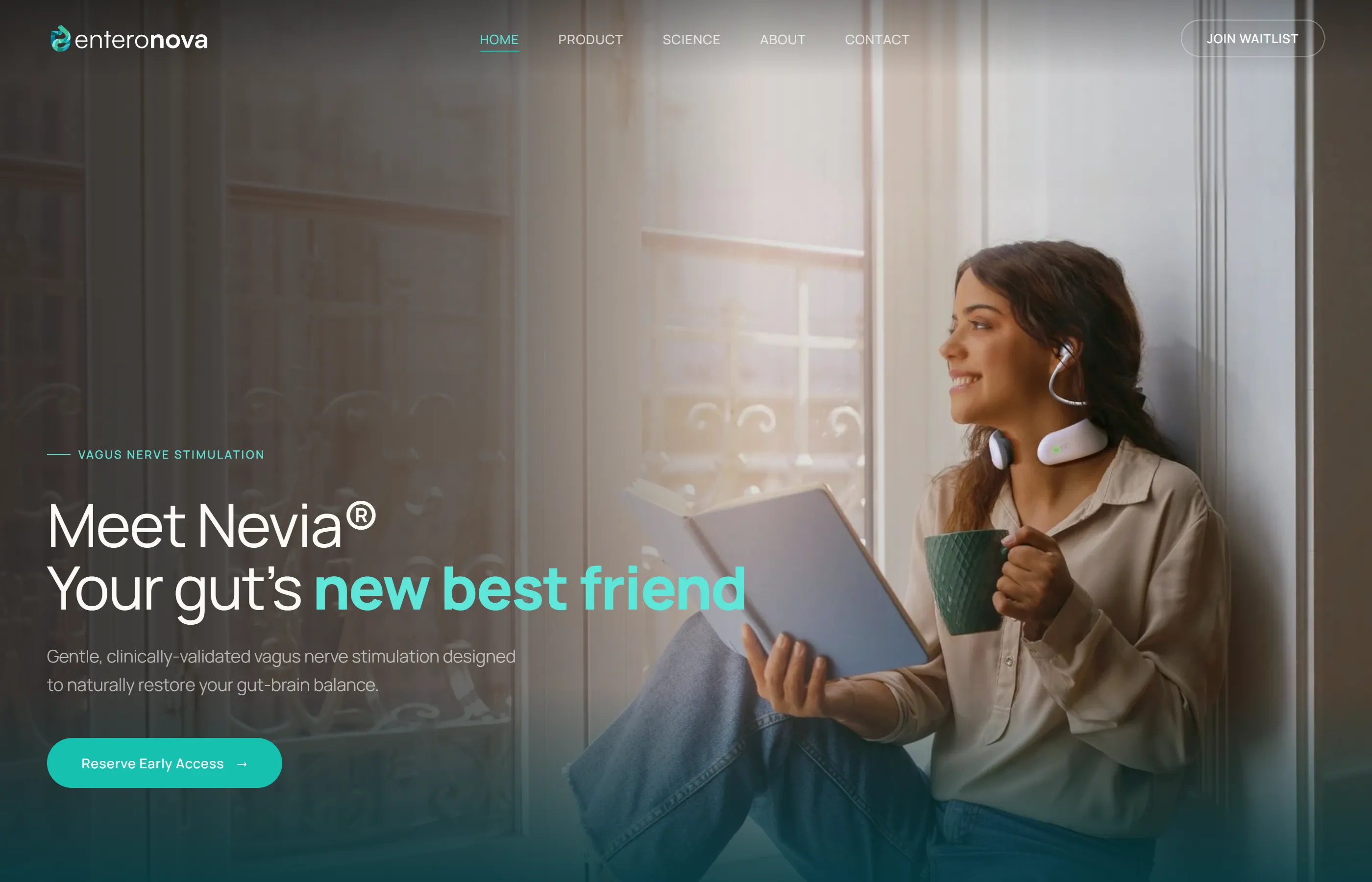
Homepage
The hero leads with “Meet Nevia® — Your gut's new best friend” — immediately establishing the product as approachable wellness, not intimidating medical device. Below, three pillars (Drug-Free Relief, AI-Powered Insights, 5 Min Sessions) communicate the core value. A clinical stats carousel surfaces trial results without requiring users to read dense tables, and partner logos (University of Washington, Crohn's Foundation) provide institutional trust.
Product Page
Structured around a three-step narrative — Wear, Start Session, Track Progress — making a neuromodulation device feel as simple as putting on headphones. The dual-stimulation mechanism (auricular + cervical) is explained visually, and a gastroenterologist quote from Dr. Scott Lee at UW Medicine adds clinical authority.
Science Page
The most data-dense page, structured as a visual pathway: Brain → Nevia → Vagus Nerve → Gut. Clinical results are organized into condition-specific groups (IBS, IBD, gut wellness) with source journal citations. The design challenge was making p-values and inflammatory marker percentages feel accessible without dumbing them down.
Homepage — hero with value proposition and clinical stats
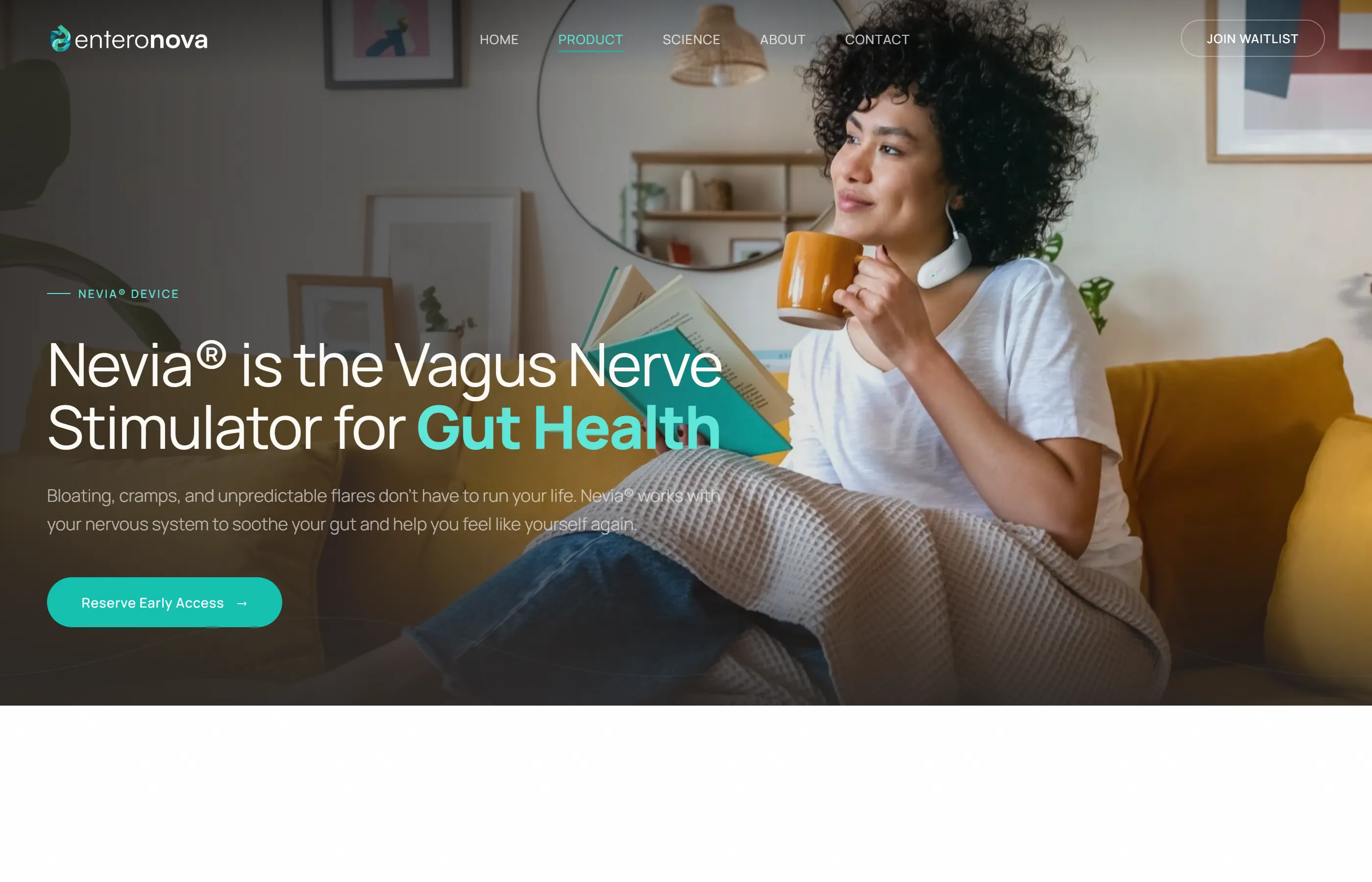
Product — three-step process and dual stimulation
Clinical Data
Making p-values feel human
The site presents 9+ clinical statistics from peer-reviewed journals. Instead of dense tables, each stat is a self-contained card with the headline result, a one-line explanation, and the source journal. Grouped by condition (gut wellness, IBS, IBD), users find what's relevant to them without wading through irrelevant data.
Partner logos from University of Washington, IBD Horizons, and the Crohn's & Colitis Foundation anchor the clinical data with institutional credibility — showing users this isn't just marketing copy, it's peer-reviewed science.
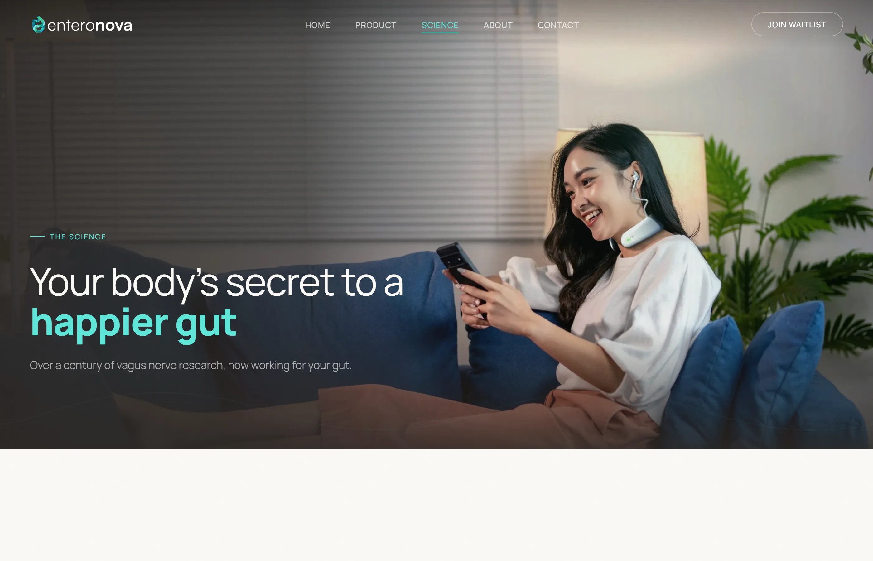
Science page — clinical results organized by condition with source citations
Implementation
Built on Shopify, designed for conversion
The site runs on Shopify with a custom theme — giving the team CMS-level content management while allowing full design control. The waitlist flow is the primary conversion path, with “Reserve Early Access” CTAs throughout. Analytics tracks the full funnel from landing to signup.
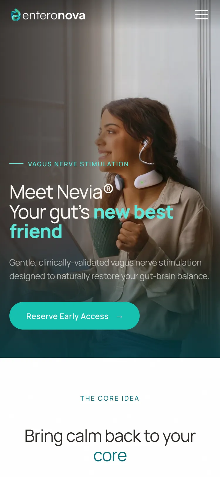
Mobile responsive — optimized for the primary browsing context
Results
From research papers to waitlist signups
The website established Enteronova's brand identity and became the primary channel for pre-launch waitlist growth. The clinical data storytelling approach — making peer-reviewed results feel human and accessible — became the template for all subsequent marketing materials.
Live
Brand identity and website shipped
5 pages
Full marketing site with clinical evidence
End-to-end
Design, development, and content strategy
Reflections
What I learned
This project taught me that the hardest design problems aren't visual — they're editorial. Deciding what clinical data to surface, how to frame it, and what to leave out required as much judgment as any layout decision. Working in the medical device space also sharpened my sensitivity to claims and language — every word carries weight when people are making health decisions. The result is a site that respects both the science and the person reading it.